Explaining Chart Summarization Using a Custom Model
Visualizing information in the form of charts, like bar charts, line charts, pie charts, or histograms, in order to obtain meaningful insights from the data is what we data scientists do daily. But what if we attempt to do the reverse—meaning extract information in the form of summaries from available charts? In this article, we, data scientists from MathCo’s Innovation team, address techniques that can be used to extract information from charts and any challenges therein.
What is chart summarization?
Inferring insights from scientific charts can be challenging for clients from non-data science backgrounds. This is where chart summarization comes into play—this technique will help keep track of relevant information that might be overlooked otherwise. It can also help prepare better reports with strong references and an illustrative description. Often, captions do not contain complete information about the features of a chart, which is where a brief description will prove to be useful. Automatic chart summarization also helps clarify information for visually impaired people, who can gain insights using screen readers.
Technically, this task of information extraction from charts can be defined as producing a descriptive summary from non-linguistic structured data (in the form of tables), which falls under the umbrella of Natural Language Generation (NLG). Natural Language Processing (NLP) and NLG are crucial aspects of the analytics industry, with a gamut of applications. The field of NLP has seen great progress after the development of transformers—an architecture made of neural networks, which is often used in translations.
One such transformer-based model is GPT3 by OpenAI. The Guardian asked it to generate an entire article by writing “a short op-ed in clear and concise language in about 500 words, with a focus on why humans have nothing to fear from AI.” This model can even compose poetry. The attention mechanism used makes all of these wonders possible.
The attention mechanism explained
Consider these sentences:
The animal did not cross the street because it was too tired.
The animal did not cross the street because it was too wide.
In the first sentence, it refers to the animal, but in the second, it refers to the street. Natural language is full of these complexities, which humans can handle surprisingly well; our brains calculate and distribute appropriate attention to context. However, the same is not so simple for a machine. This is why transformers are useful—they understand what to focus on in a sentence and how much attention to pay to each part.
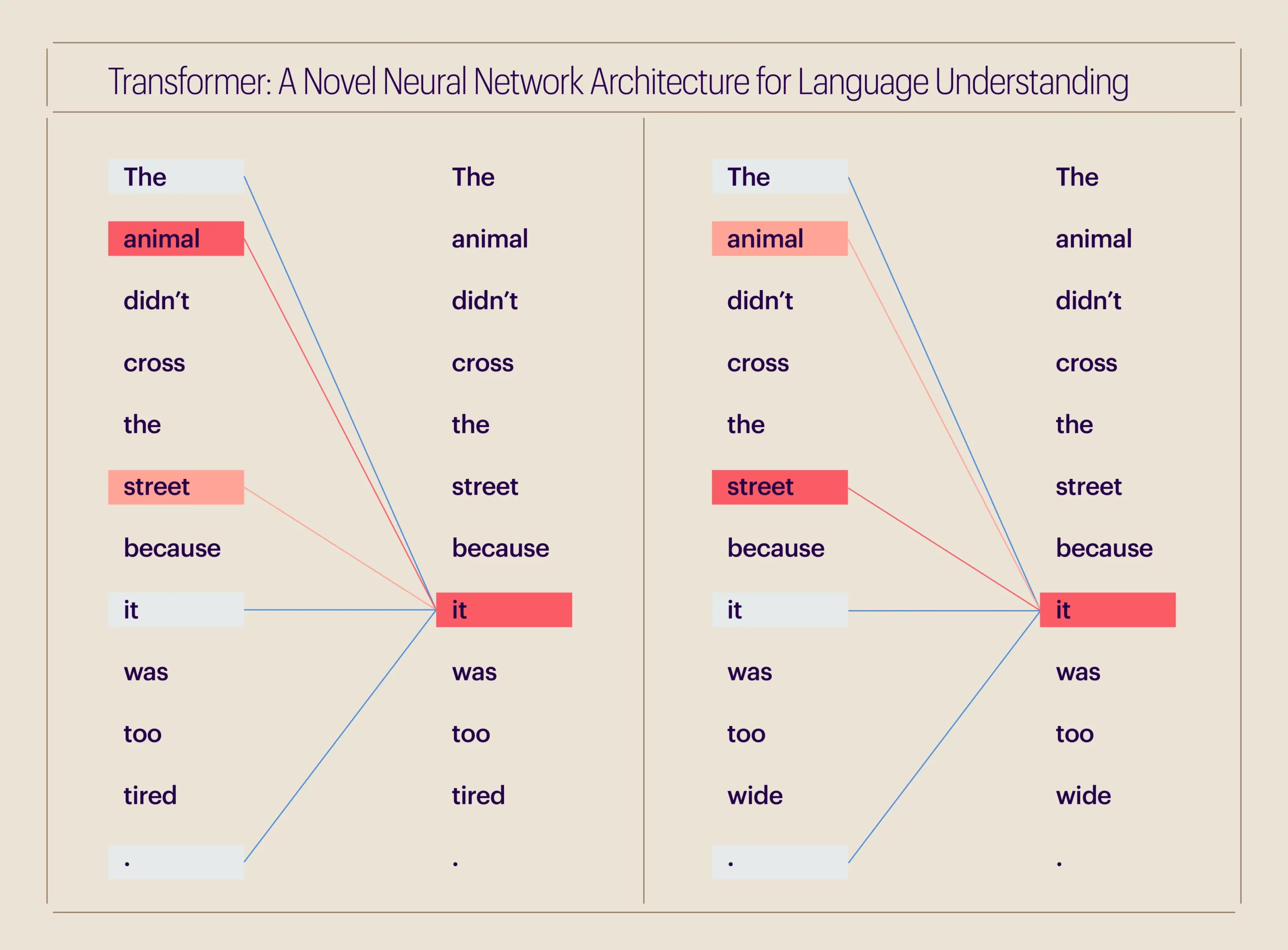
We use this attention mechanism for various tasks like writing or summarizing articles, retrieving machine translation documents, and more.
For our purpose, we have used the same translation-based model, the ‘T5 model’, to translate a chart into comprehensible text, where one language consists of numbers (i.e., chart information) and the other is simple English. The Text-to-Text Transfer Transformer, known as the T5 model, is more efficient in text-to-text tasks, meaning for any given text input, it will produce a text-based output. Here’s how we trained one such model to read numbers (in charts) and generate text summaries.
We adopted the approach of converting this image-to-sequence problem into a sequence-to-sequence problem. An image-to-sequence task involves interpreting information from an image and giving text as an output, e.g., generating a caption for an image. A sequence-to-sequence task implies a text-to-text conversion, e.g., translating French to English, as below. Here, an encoder–decoder-based transformer was used for translation.
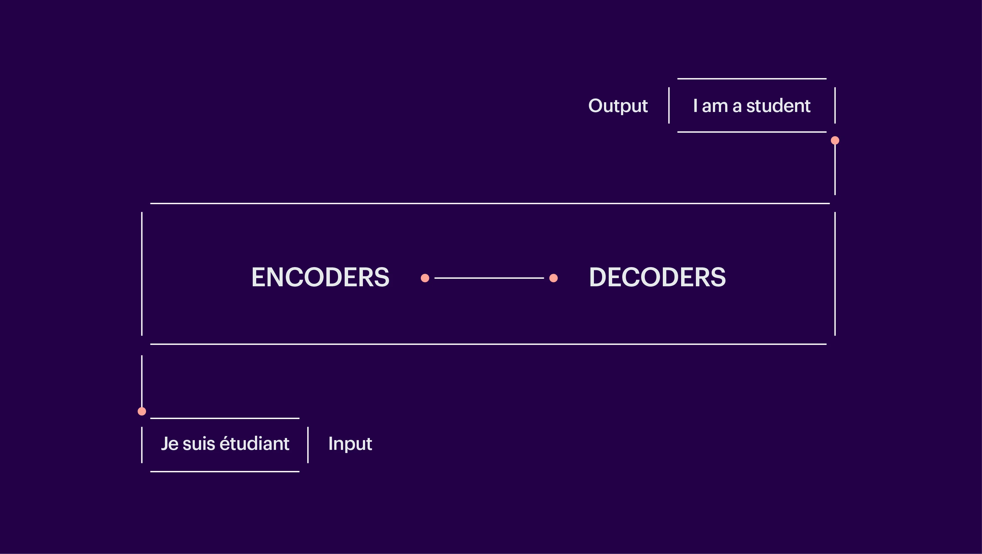
Fig. 2: A sequence-to-sequence task using an encoder–decoder-based transformer.
Our approach for this task was to work with the chart data and not with the chart images. So, we converted the chart data into a sequence of data points.
We scraped data from an online statistical data portal, Statista, for different categories like aviation, pharmaceuticals, manufacturing, banking, and finance. The scraped data included the table, chart images, chart title, and the available summary or description. An enhanced transformer approach was then followed, where a data variable substitution method was also applied to minimize hallucination, an issue where NLG models predict incorrect words (or “tokens”), which degrades the factual accuracy of the generated summary. To combat this problem, the approach we followed considered seven categories of data variables, viz., subjects, dates, axis labels, titles, table cells, trend, and scale. If the generated token matched a predefined data variable, a lookup operation was performed to convert the generated variable into corresponding chart data.
In another attempt, we used the T5 model from the Hugging Face library —an open-source library built for researchers, machine learning (ML) enthusiasts, and data scientists—to build, train, and deploy various ML models to predict chart summaries.
Before performing further analysis, we divided the entire data set into the following:
- A training set, i.e., a sample of data used to fit the model.
- A validation set, a sample of data to get an unbiased evaluation of a model fit on the training data set.
- A test set, a sample of data used for the unbiased evaluation of the final model.
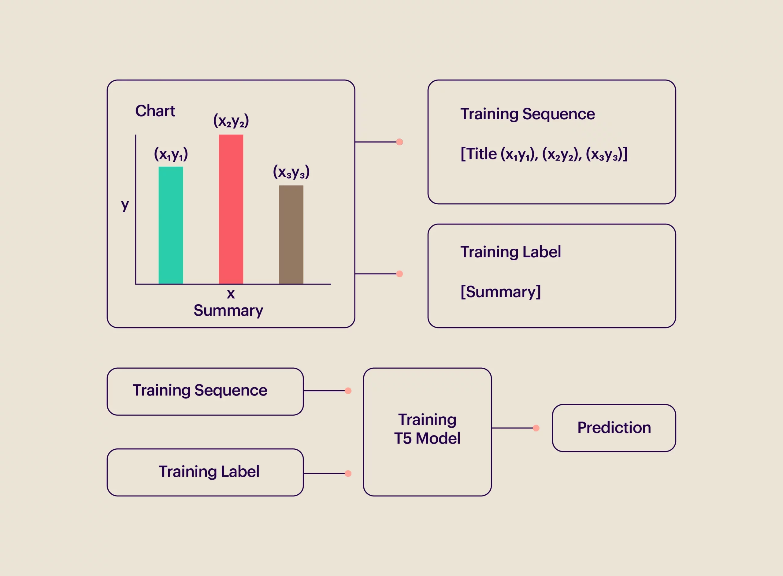
The numbers of the data samples for the train set, test set, and valid set were 5703, 1222, and 1222, respectively. The T5 model was trained by crafting the data in a different manner—the data, title, and summary for each chart were concatenated. Below is a sample piece of data from the train set.
Sample train data: {‘data’: “‘title’: ‘Global spending on motorsports sponsorships 2011 to 2017’ ‘data’: ‘Year 2017 Spending_in_billion_U.S._dollars 5.75 Year 2016 Spending_in_billion_U.S._dollars 5.58 Year 2015 Spending_in_billion_U.S._dollars 5.43 Year 2014 Spending_in_billion_U.S._dollars 5.26 Year 2013 Spending_in_billion_U.S._dollars 5.12 Year 2012 Spending_in_billion_U.S._dollars 4.97 Year 2011 Spending_in_billion_U.S._dollars 4.83 ‘ “}
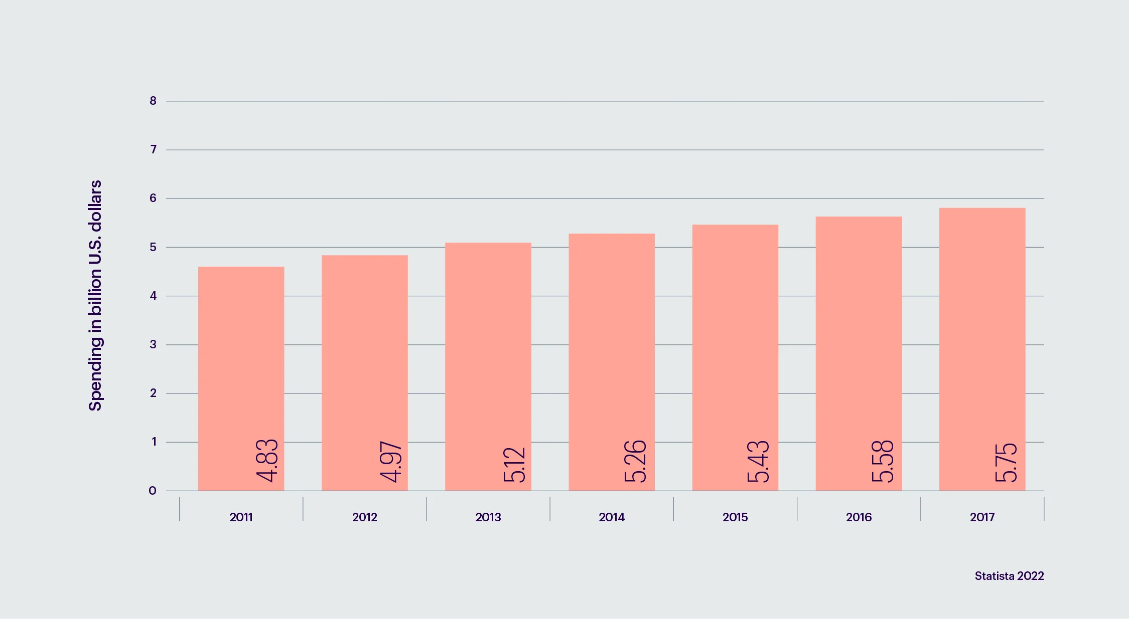
Original summary: The amount spent globally on motorsports sponsorship from 2011 to 2017 is displayed in the above table. The total amount spent on racing sponsorships worldwide in 2013 was USD 5.12 billion.
Model output: “This statistic shows the global spending on motorsports sponsorships from 2011 to 2017. In 2017, 5.75 billion U.S.D. were spent on sponsorships.”
From the above train example, we can see that our model precisely predicted the summary by interpreting the chart data with good numerical accuracy.
Metrics: In order to evaluate the results, we considered ROUGE (Recall-Oriented Understanding for Gisting Evaluation) metrics, which are specifically applicable to summarization tasks. It matches the number of matching n-grams between the model-generated text and the reference text, i.e., the original text.
The average ROUGE scores for the train, valid, and test sets are as follows:
- Training set = 0.42
- Validation set = 0.43
- Test set = 0.44
One of the results from the sample test data can be seen below.
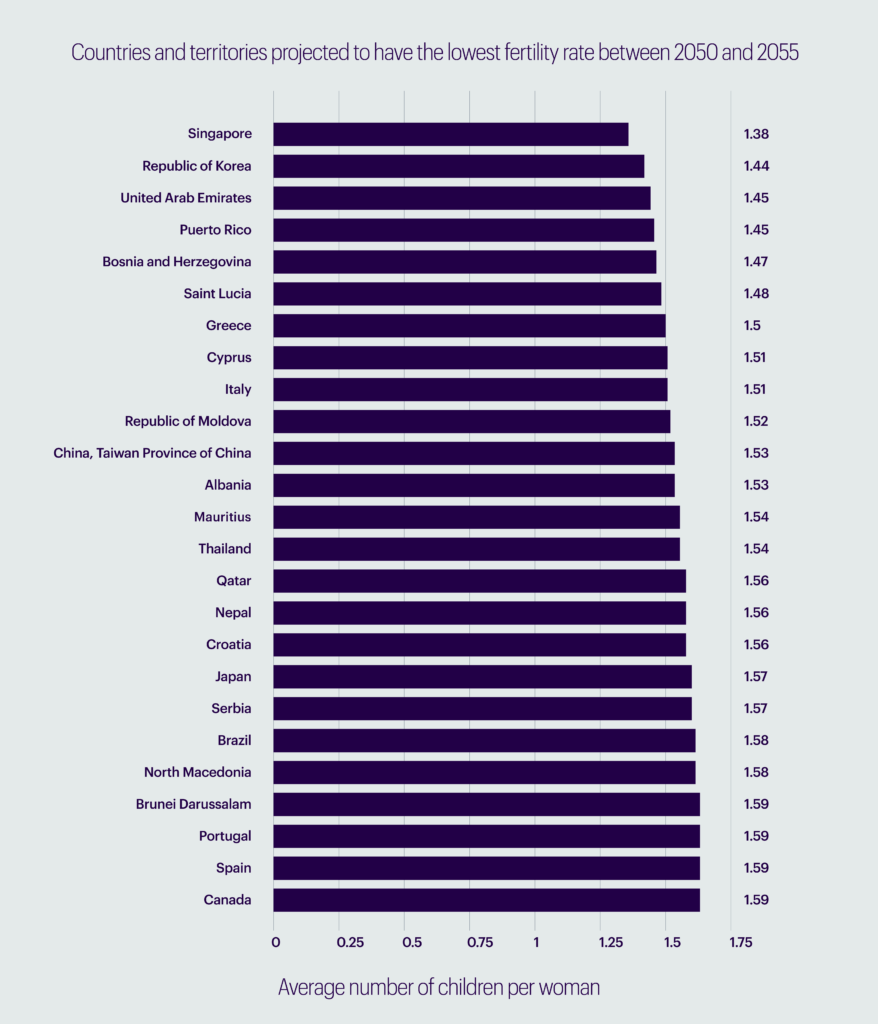
Original summary: The nations and territories with the lowest anticipated fertility rates in the period between 2050 and 2055 are included in this data. Singapore is predicted to have the lowest fertility rate in this period, with an average of 1.38 children born per woman.
Model output: “This statistic shows the number of children, with the lowest global fertility rates from 2050 to 2055 being in Singapore. The average fertility rate was 1.38 children per woman.”
Our model captured the context and numbers fairly well, but there is scope for further improvement when it comes to generating factually accurate summaries. We are already experimenting with fine-tuning our model with a larger and more diversified dataset for better and more stable results. A mature model can then be deployed on our projects with clients to assist executives with our data findings.
References
- “A Robot Wrote This Entire Article. Are You Scared yet, Human? | GPT-3.” The Guardian, September 8, 2020. https://www.theguardian.com/commentisfree/2020/sep/08/robot-wrote-this-article-gpt-3.
- “The Statistics Portal.” Statista. Accessed October 17, 2022. https://www.statista.com/.
- Obeid, Jason, and Enamul Hoque. “Chart-to-Text: Generating Natural Language Descriptions for Charts by Adapting the Transformer Model.” arXiv.org, November 29, 2020. https://arxiv.org/abs/2010.09142.
- T5. Accessed October 18, 2022. https://huggingface.co/docs/transformers/model_doc/t5.
Glossary
1. NLG (Natural Language Generation): NLG is a branch of artificial intelligence that converts structured input data into human-readable text.
2. NLP (Natural Language Processing): NLP is a branch of artificial intelligence that enables computers to understand text and speech similar to human understanding capabilities.
3. Transformer: A transformer is an architecture made up of neural networks with a novel encoder-decoder framework. It has emerged to solve sequence-to-sequence tasks, such as translating from one language to another, efficiently.
4. Scrape: Data scraping is the process of extracting data from a website or database into a local file saved on a user’s PC.
Further reading on Transformers
1. https://jalammar.github.io/illustrated-transformer/
2. https://www.eidosmedia.com/blog/technology/machine-learning-size-isn-t-everything
