Vincent van Gogh’s The Starry Night is one of the most famous paintings in the world. Instantly recognizable, its various recreations and renditions can be seen on murals, notebook covers, and even memes. But did you know that Van Gogh’s iconic brushstrokes address an unsolved physics problem? Scientists who attempted to construct a theoretical model describing the behavior of turbulent flow still wonder how the painter was able to capture it so beautifully decades before the phenomenon was ever mathematically analyzed.
Art and math
For most people, art and math have nothing in common with each other. But those with insight into the disciplines know that the two have overlapped and complemented each other throughout history. You simply need to look at how some of the most well-known artworks have solid mathematical foundations that guide their aesthetics—da Vinci’s Mona Lisa utilizes the golden ratio to produce perfection in its proportions, the Greek sculptor Polykleitos implemented a 1:√2 ratio to create the ideal human body, and Caillebotte’s Paris Street, A Rainy Day is an excellent example of linear perspective in art. On the other side of the coin, which is much lesser known, are artists like M.C. Escher, who used his artistic skills to visualize mathematical concepts in elegant and innovative ways. Though Escher was never formally trained in mathematics, he shared the feeling with many mathematicians that abstract mathematical concepts can be better studied visually. His piece Relativity, for example, was able to portray a physically impossible world using mathematical concepts that had never been explored seriously. Escher also created a series of images that used his signature style along with concepts like tessellation, symmetry, and geometry to give form to abstract ideas. As art moved further into digital spaces, it became even more entwined with the mathematical rules and principles that governed how computers executed code.
Design and analytics
Narrowing our focus to the world of analytics, design has helped visualize complex statistical concepts such as gradient descent to identify the global cost minimum, principal component analysis on a quadrant chart, and a lot more. Like math and art, design and analytics can together redefine the way we are working today. While they are still thought of as completely independent domains, we have grown to realize that they can complement each other in a business setting.
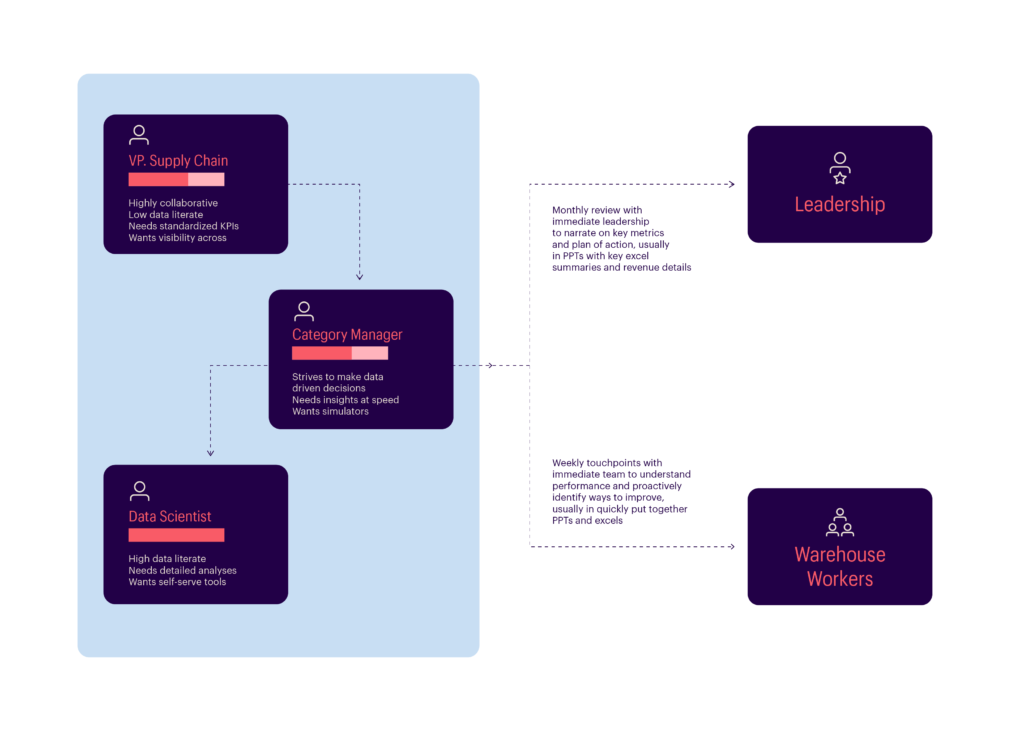
In the early days of analytics, when it was still growing in capability and scope, insights were mathematical and accessible to only those who understood statistical analysis. Today, analytics is more widespread, and insights are easily accessible. For companies to have a real advantage against their competition, people across the organization need to adopt data-driven decisions, from the VP of Supply Chain to a mechanical assistant in a warehouse. While creating analytical solutions has never been easier, wider adoption still remains a big challenge. Perhaps design can provide a solution.
Design + analytics
In the business context, it can be a fallacy to automatically assume that a client’s problem can be solved with an analytics solution. Often, it is a combination of insight, the business’s ability to use the insight every day, and regular monitoring of changes that make an impact. This is why business problems are not just analytical problems but also of design.
The reality is that we ask a lot from users when we build these solutions—to build new habits out of the blue, to change their way of working, to use unfamiliar tools, etc. Using design in conjunction with analytics helps understand people and their culture a lot better, and that is the missing piece required to build business-driven, user-centric products. These domains can feed off and improve upon each other to create more efficient solutions. Let’s look at a few instances of how they can work together for better business outcomes.
Defining the right problem:
In today’s world, we spend very little time defining problems, and that has a barrage of connected catastrophic effects. For example, when we decide that a ‘demand forecast’ is the answer to an inventory problem, we may end up ignoring other factors—from technology to people working on the ground—while building a solution. Even if the solution is a demand forecasting tool, there should be additional considerations to effectively solve the problem, like improving the visibility of information through technology and educating workers on the cost of their errors to truly embed that data-driven culture. Just a simple prediction will not bring about that change.

Here is where translating a business problem to an analytical as well as a design problem enables change. Using UX research practices such as conducting user interviews to truly understand their day-to-day activities, and a ride-along to understand their real pain points goes a longer way than just a prediction.
Enhancing user experience:
Once the right problems have been identified and defined, we can start building the solution. Design plays an important role in creating a smooth user experience for the consumer-facing front end of an analytical solution. However, there is a tendency to do only the bare minimum when it comes to curating this experience due to the fact it is a ‘business application.’ Those who typically design these applications base their design on the way data is structured or the way the model produces results and not on how decisions are made.
It is crucial to balance the needs of different types of users. Using UX design principles such as ‘user flow mapping’ helps better understand the user’s decision-making journey. Paying attention to small details is quite important here. For example, when there are low-accuracy predictions or a feature that does not work, the error messaging has a large impact on the user experience.

So does something like page navigation. When a user lands on a dashboard and sees a KPI in red, the application needs to guide the user to the explanations and answers that they need, to create a smooth user experience. This can be pushed even further, especially if we look to and learn from the design standards set in B2C platforms and applications. The value derived from analytics can be enhanced if business users are given a personalized experience that foregrounds the required insights and seamlessly incorporates the algorithm with design elements that are already familiar to them. This way, even users with no expertise in analytics will be able to draw value from analytical tools.
Generating faster insights:
Today, you can notice the best commingling of design and analytics when it comes to using data visualization and data storytelling techniques to convey the insights and value generated from data to business users. Those who work in this field are aware of the potential that effective visualization can add, and design principles are now well-integrated into analytics projects, which makes it easier to quickly obtain insights. Data storytelling techniques also help users find the right business questions and the answers that help them create growth. However, everyday usage depends on a lot of other aspects as well, which are often sidelined, from the way filters are designed to the warm content that welcomes you to the application.
To truly ensure that people build the habit of using the application, we need to follow a very clear approach that gets them ‘hooked.’ The UX copy plays a critical role in encouraging users to come back the next day for additional insights, from onboarding the user to giving them clarity at every stage of their journey. Something else that hinders solutions from being widely adopted is aesthetics—simply put, looking at an unappealing dashboard with bright or clashing colors is painful to the eye. Solutions need to be designed with careful consideration of what each color conveys and what they represent to the user.
Improving data literacy and adoption:
Driving the adoption of analytics and analytical tools among business users is more than just providing training sessions during product deployment. It is crucial to effectively communicate the value that can be derived using these tools. Implementing better integration between design and analytics can help greatly in orchestrating the solution usage journey among business users.
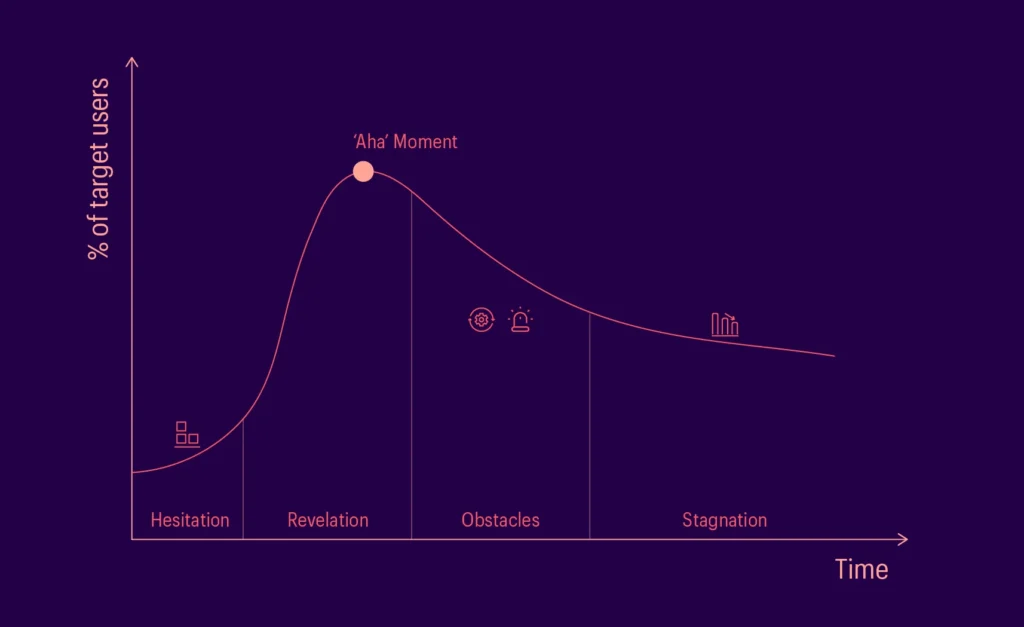
An ideal solution usage journey is one where there are well-designed onboarding processes that can aid in users getting to the ‘a-ha moment’—the moment at which the utility and value of a tool become clear enough for a user to start using it—as soon as possible. Once users quickly adopt the tool, they are bound to run into obstacles and errors that can negatively affect adoption levels. It is important to create effective recovery processes at this point to continue holding user interest. All these processes need to be well-integrated and should facilitate a seamless transition between the solution and other applications.

This journey needs to be supported by four touchpoints:
- Excite: Here is where we grab the user’s attention for an upcoming application, something that would make their day-to-day work easier. Curating messages that users will relate to will ensure anticipation for the solution being built. These messages can then be conveyed through well-designed posters, flyers, or even emails with great copy to attract people’s attention.
- Set Expectations: Involving stakeholders and users in the creation process and communicating to them the present and future capabilities of the solution will help temper the expectations of everyone involved. This transparency helps to ensure that the stakeholders are realistic about their expectations and are not surprised or shocked when they begin to use the solution.
- Educate: AI and machine learning products can be quite new to many users, which could prevent them from being able, or even wanting, to use them in their work. The way to counter this hesitation is to educate users on how to best utilize the product—through gamified tutorials, attractive guides, videos, or assistant chatbots.
- Reinforce: Finally, in order to maintain high adoption rates, it is important to reinforce usage and communicate to the users how much value can be created using analytical products. Some ways to convey utility and best practices that provide positive results are through testimonials from other users—which create a sense that they are missing out on something great—awarding badges to users who use the solution well, and designing mascots that can stay in touch with users.

Conclusion
In analytics, we have to often convince the people who build solutions and manage the projects to also use a design-oriented approach when tackling business problems. This is because the results of this approach can take a long time to be apparent and can be difficult to measure. We just need to return to M.C. Escher’s story to understand how two disciplines considered disparate by many have the ability to influence and inspire each other.
Sir Roger Penrose, a famous British mathematician and philosopher, was greatly fascinated by how Escher created an impossible world in Relativity. Escher’s work inspired him to delve into research and eventually co-author a paper called Impossible Objects: A Special Type of Visual Illusion, which famously featured sketches of two impossible objects which are now widely recognized—the Penrose Triangle and the Penrose Stairs. The paper would then go on to influence many of Escher’s future works like Waterfall, which would artistically incorporate Penrose’s impossible objects into its own worlds.
Like Escher and Penrose, a collaboration between design and analytics can validate each other’s approaches, enrich both domains, and make it possible to create value beyond just the sum of their parts. Analytics teams everywhere need to wake up to the power of design in their solutions and set up teams that can focus on crafting efficient user-centric products.
